【css实现:渐变文字】巧妙使用background-clip属性
已被阅读 1796 次 | 文章分类:css | 2022-03-20 00:26
css实现渐变文字
1 效果
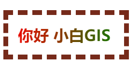
(1)用背景图片实现
<!DOCTYPE html>
 <html>
<head>
<meta charset="utf-8">
<title></title>
<style type="text/css">
h1{
    background: url('./1.webp');
    background-size: 100% 100%;
    -webkit-background-clip: text;
    -webkit-text-fill-color:transparent;
    width: 200px;
    border:1px solid #762a1a;
 }
 </style>
</head>
<body>
<h1>你好 小白GIS</h1>
</body>
</html>
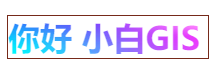
(2)用渐变色实现
<!DOCTYPE html>
 <html>
<head>
<meta charset="utf-8">
<title></title>
<style type="text/css">
h1{
    background-image: linear-gradient(90deg,red,#008000);
    background-size: 100% 100%;
    -webkit-background-clip: text;
    -webkit-text-fill-color:transparent;
    width: 200px;
    border:1px solid #762a1a;
 }
 </style>
</head>
<body>
<h1>你好 小白GIS</h1>
</body>
</html>

线性渐变更多使用,可以参考【css笔记:线性渐变】纯css实现黑白网格效果
2 实现原理
上面核心在于background-clip属性的使用;咱先理解为background-clip:text就是用文字取反背景色;下面介绍下这个属性; background-clip 设置元素的背景(背景图片或颜色)是否延伸到边框、内边距盒子、内容盒子下面。简单说就是控制背景色的有效范围;常用的值有如下:
background-clip: border-box;     // 背景色延伸到边框,即整个边框内部都有效
background-clip: padding-box;   // 背景色延伸到内边距,即内边距内部都有效
background-clip: content-box;    // 背景色延伸到内容,即内容区域有效
background-clip: text;                 // 背景色在文字下面,即只对内部文字有效
看到这几个border-box、content-box是不是比较熟悉,对就是盒子模型;简单提一下吧
2.1 盒子模型
盒子模型有两种;w3c的标准盒子模型和IE的怪异盒子模型;
(1)如下定义一个简单的div:
<!doctype HTML>
<html>
    <head>
        <meta charset="utf-8"></meta>
        <style>
            .main{
                width:200px;
                height:200px;
                background:#762a1a;
                color:white;

            }

        </style>
    </head>
    <body>
        <div class="main">
            <span>这是一个理解box-sizing的例子</span>
        </div>
    </body>
</html>
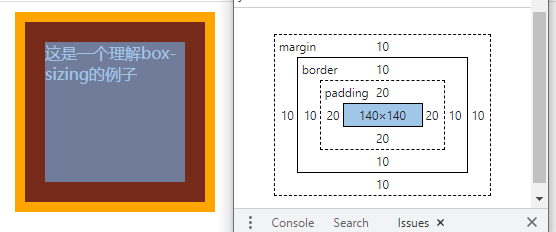
一个盒子模型有四部分组成:content,padding,border,margin;
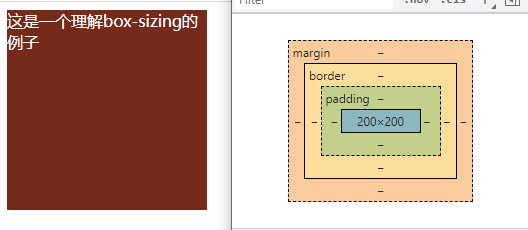
上面的div我们只设置了盒子宽高;
(2)设置边距和边框的div
.main{
    width:200px;
    height:200px;
    background:#762a1a;
    color:white;
    padding: 20px;
    margin: 10px;
    border:10px solid orange;
}
可以看到现在盒子变成这样了;
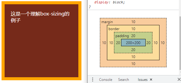
目前盒子整个被撑大了,现在盒子的宽高分别是
宽=200+20*2+10*2+10*2=280px

高=200+20*2+10*2+10*2=280px
所以:我们上面设置的width和height成为了内部内容的宽高;这就是w3c的标准盒子模型;设置内外边距和边框宽度都是会撑大盒子的。
怎么定义一个标准盒子模型呢;用box-sizing:content-box;现在盒子的默认属性就是content-box;所以不用设置
与之相对应的是IE的怪异盒子模型:通过属性box-sizing: border-box设置
2.2 怪异盒子模型
怪异盒子模型长啥样呢,代码和效果如下
.main{
    width:200px;
    height:200px;
    background:#762a1a;
    color:white;
    padding: 20px;
    margin: 10px;
    border:10px solid orange;
    box-sizing: border-box;
}
所以:我们设置的宽高就是整个盒子的宽高;而我们的内容被压缩了
3 回归正题:background-clip 属性
为了突出效果,样式调整一下;
h1{
    background-image: linear-gradient(90deg,red,#008000);
    background-size: 100% 100%;
    width: 200px;
    border:10px dashed #762a1a;
    padding: 20px;
 }
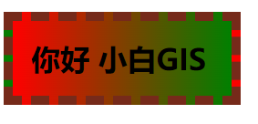
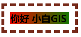
(1)background-clip: border-box;
背景色延伸到边框,即整个边框内部都有效
h1{
    background-image: linear-gradient(90deg,red,#008000);
    background-size: 100% 100%;
    -webkit-background-clip: border-box;
    width: 200px;
    border:10px dashed #762a1a;
    padding: 20px;
 }
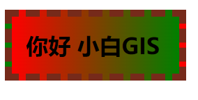
(2)background-clip: padding-box;
背景色延伸到padding区域 不包含边框
h1{
    background-image: linear-gradient(90deg,red,#008000);
    background-size: 100% 100%;
    -webkit-background-clip: padding-box;
    width: 200px;
    border:10px dashed #762a1a;
    padding: 20px;
 }
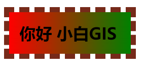
(3)background-clip: content-box;
背景色延伸到内容区域 不包含padding和边框
h1{
    background-image: linear-gradient(90deg,red,#008000);
    background-size: 100% 100%;
    -webkit-background-clip: content-box;
    width: 200px;
    border:10px dashed #762a1a;
    padding: 20px;
 }
(4)background-clip: text;
背景色延伸到文字下面 不包含内容、padding和边框
h1{
    background-image: linear-gradient(90deg,red,#008000);
    background-size: 100% 100%;
    -webkit-background-clip:  text;
    width: 200px;
    border:10px dashed #762a1a;
    padding: 20px;
 }
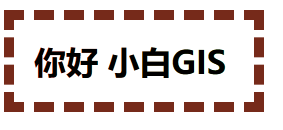
如上所示,基本演示了background-clip几种重要属性;但是文字渐变没有出现;是因为文字有默认颜色,所以需要设置透明
h1{
    background-image: linear-gradient(90deg,red,#008000);
    background-size: 100% 100%;
    -webkit-background-clip: text;
    -webkit-text-fill-color: transparent;
    width: 200px;
    border:10px dashed #762a1a;
    padding: 20px;
 }