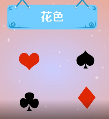
[css绘制图形:扑克牌花色] 红心、黑桃、方块、梅花
已被阅读 3136 次 | 文章分类:css | 2022-05-02 00:31
用css实现扑克牌花色的核心是对before和after伪元素的使用;当然,我们可以借助多个div去实现;不过显然跟伪元素相比,多个div显得比较低级些。
扑克牌花色
1 红心
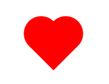
思路如下:
1 创建一个正方形div,然后旋转45度,创造出下面的拐角

2 通过before画一个圆,位置向左偏移正方形的一半距离

3 通过after画一个圆,位置向上偏移正方形的一半距离
代码如下:
<html>
    <head>
        <style>
            .heart_wrapper{
                position: absolute;
                top: 100px;
                left: 100px;
            }
            .heart{
                width: 50px;
                height: 50px;
                background-color: red;
                position: relative;
                transform: rotate(45deg);
            }
            .heart::before,.heart::after{
                content: "";
                width: 50px;
                height: 50px;
                background-color: black;
                position: absolute;
                border-radius: 50%;
            }
            .heart::before{
                left: -25px;
            }
            .heart::after{
                top: -25px;
            }

        </style>
    </head>
    <body>
        <div class="heart_wrapper">
            <div class="heart"></div>
        </div>
    </body>
</html>
将两个圆的颜色设置为red即可;
2 方块
方块的实现核心是伪元素after和边框border
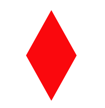
实现思路:一个正三角和一个倒三角的拼接

1 实现一个正三角,用border-bottom实现;设置div的border即可

2 实现一个倒三角,用border-top实现;设置:after的border即可
代码如下
<html>
    <head>
        <style>
            .diamond_wrapper{
                position: absolute;
                top: 100px;
                left: 100px;
            }
            .diamond{
                width: 0;
                height: 0;
                border: 50px solid orange;
                border-bottom:90px solid red;
                position: relative;
            }

            .diamond::after{
                content: "";
                position: absolute;
                left: -50px;
                top: 90px;
                width: 0;
                height: 0;
                border: 50px solid black;
                border-top:90px solid red;
            }

        </style>
    </head>
    <body>
        <div class="diamond_wrapper">
            <div class="diamond"></div>
        </div>
    </body>
</html>
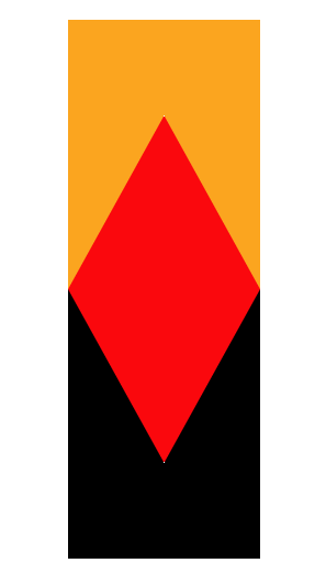
橙色部分是原生div实现;黑色部分是用after实现的div;上面的div是通过设置border宽度实现,将边框色设置为transparent即可。
注:伪元素before和after的定位属性不会默认根据自身div定位;所以还是需要给自身div设置relative属性。
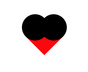
3 黑桃
思路:一个正方形、两个圆、一个小三角
首先绘制出所有元素;
<html>
    <head>
        <style>
            /* 外层容器 */
            .shape{
                margin-top: 100px;
            }
            /* 1  先画一个正方形 */
            .heart{
                width: 30px;
                height: 30px;
                background-color: #fff;
                display: inline-block;
                margin: 0 10px;
                position: relative;
            }
            /* 2 画两个偏移的圆 通过伪元素创建 */
            .heart:before,.heart:after{
                content:"";
                border-radius: 50%;
                height:30px;
                width: 30px;
                background:black;
                position: absolute;
            }
            /* 3 画小尾巴 通过border创建 */
            .tale{
                position: absolute;
                bottom: 20px;
                right: -3px;
                background: red;
                width:0;
                height:0;
                border-left: 4px solid transparent;
                border-right: 4px solid transparent;
                border-top: 20px solid green;
            }
        </style>
    </head>
    <body>
        <div class="shape">
            <span class="heart">
                <span class="tale"></span>
            </span>
        </div>
    </body>
</html>
然后加上每个元素的偏移和旋转属性
<html>
    <head>
        <style>
            /* 外层容器 */
            .shape{
                margin-top: 100px;
            }
            /* 1  先画一个正方形 */
            .heart{
                width: 30px;
                height: 30px;
                transform: rotate(135deg);
                background-color: #fff;
                display: inline-block;
                margin: 0 10px;
                position: relative;
            }
            /* 2 画两个偏移的圆 通过伪元素创建 */
            .heart:before,.heart:after{
                content:"";
                border-radius: 50%;
                height:30px;
                width: 30px;
                background:black;
                position: absolute;
            }
            .heart:before{
                top:-15px;
                left:0;
            }
            .heart:after{
                left:15px;
                top:0;
            }
            /* 3 画小尾巴 通过border创建 */
            .tale{
                position: absolute;
                bottom: 20px;
                right: -3px;
                background: transparent;
                width:0;
                height:0;
                border-left: 4px solid transparent;
                border-right: 4px solid transparent;
                border-top: 20px solid orange;
                transform: rotate(45deg);
            }
        </style>
    </head>
    <body>
        <div class="shape">
            <span class="heart">
                <span class="tale"></span>
            </span>
        </div>
    </body>
</html>
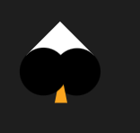
最后将颜色统一设置为黑色

4 梅花
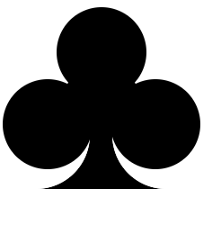
思路:三个圆、一个中间div、一个尾巴div

三个圆:一个div、及before、after实现

中间部分:一个div

小尾巴:一个div、before和after实现
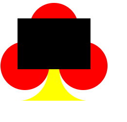
调整颜色得到结果.
<html>
    <head>
        <style>
            /* 外层容器 */
            .circle{
                width: 100px;
                height: 100px;
                background: red;
                border-radius: 50px;
                position: absolute;
                left: 63px;
                z-index: 100;
            }

            .circle:before{
                content: "";
                width: 100px;
                height: 100px;
                background: red;
                border-radius: 50px;
                position: absolute;
                left: -60px;
                top: 80px;
                z-index: 100;
            }
            .circle:after{
                content: "";
                width: 100px;
                height: 100px;
                background: red;
                border-radius: 50px;
                position: absolute;
                left: 60px;
                top: 80px;
                z-index: 100;
            }
            .triangle{
                width: 0;
                height:0;

                border-left: 75px solid black;
                border-right: 75px solid black;
                border-bottom: 105px solid black;
                position: absolute;
                top: 40px;
                left: 38px;
                z-index: 100;
            }

            .base{
                background: none repeat scroll 0 0 yellow;
                height: 70px;

                position: absolute;
                left: 0;
                top: 140px;
                width: 200px;
                z-index: 0;
            }
            .base::before{
                width: 0px;
                height: 10px;
                position: absolute;
                left: 0;
                content: "";
                border-left: 50px solid white;
                border-right: 50px solid white;
                border-top: 10px solid white;
                border-bottom: 50px solid white;
                border-top-left-radius: 0px;
                border-top-right-radius: 0px;
                border-bottom-left-radius: 0px;
                border-bottom-right-radius: 60px;
            }
            .base::after{
                width: 0px;
                height: 10px;
                position: absolute;
                left: 125px;
                content: "";
                border-left: 50px solid white;
                border-right: 50px solid white;
                border-top: 10px solid white;
                border-bottom: 50px solid white;
                border-top-left-radius: 0px;
                border-top-right-radius: 0px;
                border-bottom-left-radius: 60px;
                border-bottom-right-radius: 0px;
            }
        </style>
    </head>
    <body>
        <div class="circle"></div>
        <div class="triangle"></div>
        <div class="base"></div>
    </body>
</html>